You have no items in your shopping cart.


[rbxshot img="images/stories/roktabs-thumb.jpg"]RokTabs Preview[/rbxshot]
What is RokTabs?
RokTabs is a fully independent and incredibly flexible standalone version of the popular template feature, RokSlide. That being, a module that displays content in tabs that are scrollable and automatic (if set). The module itself is installable into Joomla and can be easier utilised on any template, not just Akiraka. As it name implies, its a tabbed based module to efficiently showcase your content to your visitors.How do I configure RokTabs?
We will take a quick look at the parameters you will find when you install this module. There are 4 columns, parameters, options, demo and description. The parameter column lists each available setting for the module; options lists the available options to choose from; demo lists the options chosen on the demo and description outlines what the module does.Parameter
Show Title
Enabled
Position
Category
Section
Order
Authors
Theme Style
Width
Max # of Tabs
Transition Duration
Transition Type
Transition Effect
Tabs Position
Tabs Title
Incremental text
Hide h6 tags
Autoplay
Autoplay Delay
Module Suffix
Demo
Yes
Yes
Right
FP Tabs
RT Demo Content
Recently Modified First
Anyone
base
230
8
600
Scrolling
Quad.easInOut
Top
By Content Title
Tab
Yes
No
2000
promo
Description
Enable/Disable the module header
Enable/Disable the module
Position of the module
Category of content
Section of content
Ordering of content
A filter for the authors
Select a theme/style
Width of the module
Max number of Tabs
Time for transition
Type of transition
The transition effect
Position of the tabs
Determine the tab title
Set an incremental text
Hide h6 titles
Rotate automatically
Set delay on auto-rotation
A module class suffix
Publié dans
Demo Pages
Choix d'une autre section
On peut mettre l'ensemble des parutions dans le même bloc, les uns après les autres :)
Publié dans
RokTabs Content
La dernière parution

Publié dans
RokTabs Content
What is the PNGfix?
If you have ever opened a webpage with a transparent PNG in Internet Explorer 6, you will see an obvious problem. The images do not appear transparent but adopts a light blue background. which is unsightly to say the least. This is the purpose of the PNGfix, to allow transparent PNG images to work correctly in the web browser Internet Explorer 6. A common way around this is to use a range of different Joomla! extensions which can be applied to your site. However, this is already built in to new RocketTheme templates (the fix already provides other solutions to various other IE6 issues). The author is this new PNGfix is Drew Diller.[readon url="http://www.dillerdesign.com/experiment/DD_belatedPNG/"]Learn More[/readon]
Below is a list of all the Rocket Theme Templates which have the PNGfix described above, incorporated into it. Also, all new templates releases will contain this as it has become an recurrent feature.
- Akiraka
- Mixxmag
How do I use the PNGfix?
To apply the PNGfix to a particular image, all you need to do is add a class, png. We have an example of image HTML code below:-<img src="image.jpg" alt="Image" />
Now add class="png" to the code such as:-
<img src="image.jpg" alt="Image" class="png" />
[span class=alert]Uninstall all other PNGfixes before using the template version, that includes plugins you may have installed into Joomla as it will conflict with the template fix[/span]
How to remove the PNGfix
If you wish to remove the PNGfix from the template, you have to remove the file and remove the reference from the rt_head_includes.php file. The file is called DD_belatedPNG.js and is located in the /templates/rt_akiraka_j15/js directory. You would then remove the following from the rt_head_includes.php file:-<script src="<?php echo $this->baseurl; ?>/templates/<?php echo $this->template?>/js/DD_belatedPNG.js"></script>
<script>
DD_belatedPNG.fix('.png');
</script>
Publié dans
Demo Pages
[video url="/feb09/video/rokcandy.mov" title="RokCandy Video Tutorial" img="images/stories/logo-editing-video.jpg" header="RokCandy Video Tutorial" label="Watch Now!" vwidth="480" vheight="336"]Learn how to configure and utilise the RokCandy Component with this detailed video tutorial.[/video]
[rbxshot img="images/stories/rokcandy-ini-thumb.jpg"]RokCandy default.ini file[/rbxshot] [rbxshot img="images/stories/rokcandy-example-thumb.jpg"]RokCandy in action![/rbxshot] [rbxshot img="images/stories/rokcandy-admin-thumb.jpg"]RokCandy Administrator[/rbxshot]
For example, [example title={title}]{text}[/example] can be set to output the following:-
What is RokCandy?
RokCandy is a new component from RocketTheme which provides BBcode-type functionality into Joomla. Therefore, you do not need to worry about the WYSIWYG editor stripping out your custom code, or worry about your HTML abilities in order to use the various Typography and other styled elements. It changes preset syntax, such as [example] to the relevant HTML code, once Joomla parse the article. What does that mean? Well, it means if you type [example] into your content, whether in HTML or normal WYSIWYG mode, it will always show [example] and will not be stripped away on save or reopen. All the changing to HTML, is done via Joomla when it outputs the article onto the site itself.[rbxshot img="images/stories/rokcandy-ini-thumb.jpg"]RokCandy default.ini file[/rbxshot] [rbxshot img="images/stories/rokcandy-example-thumb.jpg"]RokCandy in action![/rbxshot] [rbxshot img="images/stories/rokcandy-admin-thumb.jpg"]RokCandy Administrator[/rbxshot]
For example, [example title={title}]{text}[/example] can be set to output the following:-
<div class="example">
	<h3>Title</h3>
	<p>Some content</p>
</div>
How do I configure RokCandy, the Syntax?
RokCandy is outfitted with prebuilt statements, however, with the overriding ability of Joomla 1.5, you can create new ones and override them in the template files, and not have to concern yourself with editing core files. The file is called default.ini and is located in the /templates/rt_akiraka_j15/html/com_rokcandy directory. Similarly, you can also add and control your own in the Administrator (Admin > Components > RokCandy). They will appear in the following format:-
[tag]{text}[/tag]=<tag>{text}</tag>
Such as
[alert]{text}[/alert]=<span class="alert">{text}</span>
As is apparent, each line is separated into distinctive sections. There are two parts, the RokCandy syntax (left of =) and the outputted HTML (right of =). You would create your own tag name and insert them between square brackets, [], followed by {text} and the closing tag with [] brackets again. This segment is followed by the = symbol and following on from that is the HTML output. Note, the {text} is required in both parts to denote what element is to be carried forward. You can use any value between the {} brackets, such as {title} or {link} as long as they are cross referenced in the HTML output as shown in the example below:-
[box title={title} link={link}]{text}[/box]=<div class="box"><h3><a href="{link}">{title}</a></h3><p>{text}</p></div>
[span class=attention]Note, the best way to understand the syntax rules is to look at the default.ini file and see what syntax we use.[/span]
[readon url="index.php?option=com_content&view=article&id=52&Itemid=77"]RokCandy Examples[/readon]
Publié dans
Demo Pages

The return of the Color Chooser is upon us, but in a revolutionary, administrator only form. The Color Chooser is an ideal feature to help web developers quickly, and easily change and test the colour schemes of their sites. Akiraka has been constructed to be fully transparent and all the colours are generated by the Color Chooser, comfortably situated in the Template Manager parameters for the template. There are 27 options to choose one which control every possible colour aspect of the template. Better yet, you can either manually input the colours, i.e. the HEX code or use the color palette, situated to the right of each option. The changes you make appear live, in a sophisticated preview above all the parameters in the administrator. Therefore, you can easily see what your custom colour scheme is going to look like, instantly.
The 27 scheme options are as follows, and the areas that they control are indicative in their name (and will be visible in the live preview):-
- Header Color
- Logo Text
- Header Text
- Header Link
- Header Overlay Style
- Showcase Color
- Showcase Text
- Showcase Link
- Showcase Highlight Text
- Showcase Highlight
- Showcase Overlay Style
- Body Color
- Body Highlight
- Body Text
- Body Link
- Main Body Overlay Style
- Bottom Bar Color
- Bottom Bar Text
- Bottom Bar Link
- Bottom Section Color
- Bottom Section Text
- Bottom Section Link
- Bottom Section Overlay Style
- Footer Color
- Footer Text
- Footer link
- Overlay Texture Style
[clear] [video url="/feb09/video/colorchooser.mov" title="Color Chooser Video Tutorial" img="images/stories/logo-editing-video.jpg" header="Color Choose Video Tutorial" label="Watch Now!" vwidth="400" vheight="320"]Learn how to configure and utilise the Color Chooser feature with this detailed video tutorial.[/video] [clear]
Creating your own presets
With Akiraka, we provide a series of preset configurations for the color chooser which you and your visitors can select from. However, if you wish to set or change these yourself, the process is extremely simple.
- Login into the Joomla Administrator
- Go to Extensions > Template Manager > rt_akiraka_j15
- Set Preset Styles to Custom
- Now, choose all the colour options you wish from the 27 options available, as well as the Overlay Texture value
- Hit the Custom Styles button in the Button menu, located in the upper right of the template manager
- This will output all the values into the Custom Style Output box, situated below the 27 options. Copy the outputted code from this box
- Open the file styles.php which is located within the /templates/rt_akiraka_j15/ directory
- Locate the following code block.
$stylesList = array( 'style1' => array('h-dark', 's-dark', 'b-dark', 'bt-dark', 'texture1', "#121212", "#86140a", "#232b00", "#000000", "#191919", "#262626", "#cc0000", "#cccccc", "#ffffff", "#ffffff", "#ff9b01", "#000000", "#ff9b01", "#ff9b01", "#afc78c", "#ffffff", "#666666", "#cccccc", "#666666", "#cccccc", "#666666", "#999999"), 'style2' => array('h-dark', 's-dark', 'b-dark', 'bt-dark', 'notexture', "#121212", "#003030", "#361705", "#000000", "#191919", "#262626", "#007E7E", "#cccccc", "#ffffff", "#ffffff", "#00CACA", "#ffffff", "#66cc66", "#60c363", "#bc9780", "#ffffff", "#666666", "#cccccc", "#666666", "#cccccc", "#666666", "#999999"), 'style3' => array('h-dark', 's-dark', 'b-dark', 'bt-dark', 'notexture', "#121212", "#233142", "#171f2a", "#000000", "#191919", "#262626", "#55729c", "#cccccc", "#ffffff", "#ffffff", "#829bc1", "#000000", "#ffcc00", "#f2c304", "#97a6b9", "#ffffff", "#666666", "#cccccc", "#666666", "#cccccc", "#666666", "#999999"), 'style4' => array('h-dark', 's-dark', 'b-dark', 'bt-dark', 'texture3', "#121212", "#484800", "#271c10", "#000000", "#191919", "#262626", "#abab00", "#cccccc", "#ffffff", "#ffffff", "#dbdd88", "#000000", "#cccc00", "#b8b803", "#d5b07c", "#ffffff", "#666666", "#cccccc", "#666666", "#cccccc", "#666666", "#999999"), 'style5' => array('h-dark', 's-dark', 'b-dark', 'bt-dark', 'texture2', "#121212", "#003754", "#222222", "#000000", "#191919", "#262626", "#2176a3", "#cccccc", "#ffffff", "#ffffff", "#209adb", "#ffffff", "#f57c00", "#f57c00", "#b0b0b0", "#ffffff", "#666666", "#cccccc", "#666666", "#cccccc", "#666666", "#999999"), 'style6' => array('h-dark', 's-dark', 'b-dark', 'bt-dark', 'texture4', "#121212", "#222222", "#3d0000", "#000000", "#191919", "#262626", "#999999", "#cccccc", "#ffffff", "#ffffff", "#999999", "#ffffff", "#63a500", "#63a500", "#f89193", "#ffffff", "#666666", "#cccccc", "#666666", "#cccccc", "#666666", "#999999"), 'style7' => array('h-dark', 's-dark', 'b-dark', 'bt-dark', 'notexture', "#121212", "#cabe9a", "#252314", "#000000", "#191919", "#262626", "#d4c595", "#cccccc", "#ffffff", "#000000", "#6a3c65", "#ffffff", "#6a3c65", "#984c98", "#D2CCA4", "#ffffff", "#666666", "#cccccc", "#666666", "#cccccc", "#666666", "#999999"), 'style8' => array('h-dark', 's-dark', 'b-light', 'bt-dark', 'texture3', "#121212", "#0099cc", "#ffffff", "#000000", "#191919", "#262626", "#0099cc", "#cccccc", "#ffffff", "#000000", "#ffffff", "#ffffff", "#007ea8", "#055a76", "#333333", "#055a76", "#666666", "#cccccc", "#666666", "#cccccc", "#666666", "#999999"), 'style9' => array('h-dark', 's-dark', 'b-light', 'bt-dark', 'texture1', "#121212", "#555555", "#ffffff", "#000000", "#191919", "#262626", "#999999", "#cccccc", "#ffffff", "#ffffff", "#cccccc", "#ffffff", "#63a500", "#63a500", "#333333", "#63a500", "#666666", "#cccccc", "#666666", "#cccccc", "#666666", "#999999"), 'style10' => array('h-dark', 's-light', 'b-light', 'bt-dark', 'texture1', "#121212", "#dfdfdf", "#ffffff", "#000000", "#191919", "#262626", "#999999", "#cccccc", "#ffffff", "#000000", "#663399", "#ffffff", "#663399", "#663399", "#333333", "#663399", "#666666", "#cccccc", "#666666", "#cccccc", "#666666", "#999999") ); - Edit that block to meet your needs, either by remove the code between $stylesList = array( and ); and copying in the code directly, or adding the new style code to the list of current styles or whatever method you prefer.
[span class=alert]Ensure that you only edit the code in between $stylesList = array( and ); and ensure it is the right format otherwise you will receive errors[/span] - Save, and upload the file to your site.
Publié dans
Demo Pages
Typography is a fundamental part of a template, providing you with the tools to characterise your content and bring it to life. There is a vast array of typography available with this template, as is with our previous releases, from list styles, notice blocks and a diverse number of other elements.
There are now 2 methods in which to implement the typography into your Joomla content:-
If you are apt with HTML, and are not implementing a site for someone who has limited coding skills, then the HTML method would be our recommended choice. [readon url="index.php?option=com_content&view=article&id=52&Itemid=77"]RokCandy Typography[/readon]
There are now 2 methods in which to implement the typography into your Joomla content:-
- HTML Mode: This is the typical approach seen in pre-2009 templates, were you had to physically add the HTML to your content in order for it to work. This can be a strenuous task for two main reasons. The first being the WYSIWYG editor of Joomla, which, more often than not would strip out the HTML from your content if you opened any formatted article with it. The second being the ability of the user, if you are using purely to the WYSIWYG editor, using the HTML mode or no editor at all can be a difficult step to reach.
- RokCandy Mode: The all new component from RocketTheme which allows you to implement typography easily, without fear of the WYSIWYG editor ruining your formatting and allows you, and/or your clients to add them to your content with ease. This is through a method similar to BBcode in a modern. WYSIWYG friendly syntax can be used, or even custom custom configured that will transform a set snippet to the correct HTML when it is parsed by Joomla.
Why use RokCandy?
RokCandy is the ideal solution for those with limited coding skills or those who implement our templates for their clients. It is free from the WYSIWYG editors horrific filtering habits and can be easily pre-configured for your personal needs or the needs of your client.If you are apt with HTML, and are not implementing a site for someone who has limited coding skills, then the HTML method would be our recommended choice. [readon url="index.php?option=com_content&view=article&id=52&Itemid=77"]RokCandy Typography[/readon]
Publié dans
Demo Pages
This tutorial page features all the typography available with the template, showcasing them in HTML form. If you wish to use the RokCandy format, which is WYSIWYG friendly, please go to the RokCandy Typography page.
This is a span that allows you to highlight words or phrases. Use the following format: <span class="highlight-red">...</span>
This is a span that allows you to highlight words or phrases. Use the following format: <span class="highlight-blue">...</span>
This is a span that allows you to highlight words or phrases. Use the following format: <span class="highlight-green">...</span>
This is a span that allows you to highlight words or phrases. Use the following format: <span class="highlight-orange">...</span>
This is a span that allows you to highlight words or phrases. Use the following format: <span class="highlight-brown">...</span>
This is a span that allows you to highlight words or phrases. Use the following format: <span class="highlight-purple">...</span>
This is a span that allows you to highlight words or phrases. Use the following format: <span class="highlight-grey">...</span>
This is a span that allows you to highlight words or phrases. Use the following format: <span class="highlight-bold">...</span>
This page shows all of the typography styles and settings for Akiraka in action. If you would like to read more detailed information on inserting the included typography into your content, check out the Akiraka Typography Tutorial.
Font Control
Akiraka allows you to have the option of simply switching the font of all the text in the template with the following setting in the template manager (select the font name to preview):-This is a ComponentHeading
Praesent rutrum sapien ac felis. Phasellus elementum dolor quis turpis. Vestibulum nec mi vitae pede tincidunt nonummy. Vestibulum facilisis mollis neque. Sed orci. Cum sociis natoque penatibus et magnis dis parturient montes, nascetur ridiculus mus. Sed euismod magna a nibh.
This is a Contentheading
Proin ac nunc eu nunc condimentum accumsan. Phasellus odio justo, euismod vitae, egestas a, porttitor in, urna. Maecenas vitae mauris. Donec vestibulum, nunc eu varius pharetra, massa est sagittis odio, sit amet eleifend elit dolor id tortor.
This is an H1 Header
Lorem ipsum dolor sit amet, consectetuer adipiscing elit. Proin sit amet odio quis sapien molestie ultrices. Vivamus quis lectus. Praesent eu mi. Curabitur pharetra leo sed nisl. Nunc vel nisi. Aliquam nulla. Etiam at est. Pellentesque arcu diam, tempus nec, sodales eu, ullamcorper quis, risus.
This is an H2 Header
Proin ac nunc eu nunc condimentum accumsan. Phasellus odio justo, euismod vitae, egestas a, porttitor in, urna. Maecenas vitae mauris. Donec vestibulum, nunc eu varius pharetra, massa est sagittis odio, sit amet eleifend elit dolor id tortor.
This is an H3 Header
Mauris euismod. In ac massa vitae quam tincidunt dapibus. Ut at tortor nec mi mattis blandit. Maecenas venenatis lorem at nulla. Phasellus a libero. Sed odio odio, eleifend dignissim, feugiat vel, tempor nec, ligula. Suspendisse lacinia convallis nulla. Vestibulum posuere, lacus aliquet pulvinar faucibus, tortor urna luctus diam, vitae ultrices ante magna non tellus.
This is an H4 Header
Mauris euismod. In ac massa vitae quam tincidunt dapibus. Ut at tortor nec mi mattis blandit. Maecenas venenatis lorem at nulla. Phasellus a libero. Sed odio odio, eleifend dignissim, feugiat vel, tempor nec, ligula. Suspendisse lacinia convallis nulla. Vestibulum posuere, lacus aliquet pulvinar faucibus, tortor urna luctus diam, vitae ultrices ante magna non tellus.
This is an H5 Header
Mauris euismod. In ac massa vitae quam tincidunt dapibus. Ut at tortor nec mi mattis blandit. Maecenas venenatis lorem at nulla. Phasellus a libero. Sed odio odio, eleifend dignissim, feugiat vel, tempor nec, ligula. Suspendisse lacinia convallis nulla. Vestibulum posuere, lacus aliquet pulvinar faucibus, tortor urna luctus diam, vitae ultrices ante magna non tellus.
Notice Styles are shown below
This is a sample of the 'attention' style. Use this style to denote very important information to your users. To use this use the folllowing html: <span class="attention">....</span> This is a sample of the 'notice' style. Use this style to denote very important information to your users. To use this use the folllowing html: <span class="notice">....</span> This is a sample of the 'alert' style. Use this style to denote very important information to your users. To use this use the folllowing html: <span class="alert">....</span> This is a sample of the 'download' style. Use this style to denote very important information to your users. To use this use the folllowing html: <span class="download">....</span> This is a sample of the 'approved' style. Use this style to denote very important information to your users. To use this use the folllowing html: <span class="approved">....</span> This is a sample of the 'media' style. Use this style to denote very important information to your users. To use this use the folllowing html: <span class="media">....</span> This is a sample of the 'note' style. Use this style to denote very important information to your users. To use this use the folllowing html: <span class="note">....</span> This is a sample of the 'cart' style. Use this style to denote very important information to your users. To use this use the folllowing html: <span class="cart">....</span> This is a sample of the 'camera' style. Use this style to denote very important information to your users. To use this use the folllowing html: <span class="camera">....</span> This is a sample of the 'doc' style. Use this style to denote very important information to your users. To use this use the folllowing html: <span class="doc">....</span>
This is a sample <pre>...</pre> tag:

div.modulebox-black div.bx1 {
  background: url(../images/black/box_bl.png) 0 100% no-repeat;
}

div.modulebox-black div.bx2 {
  background: url(../images/black/box_tr.png) 100% 0 no-repeat;
}

div.modulebox-black div.bx3 {
  background: url(../images/black/box_tl.png) 0 0 no-repeat;
  padding: 0;
  margin: 0;
}
Blockquote Styles
This is a blockquote, you will want to use the following formatting: <blockquote>....</blockquote>Praesent rutrum sapien ac felis. Phasellus elementum dolor quis turpis. Vestibulum nec mi vitae pede tincidunt nonummy. Vestibulum facilisis mollis neque. Sed orci. Cum sociis natoque penatibus et magnis dis parturient montes, nascetur ridiculus mus. Sed euismod magna a nibh.
This is a blockquote, you will want to use the following formatting: <blockquote class="blue">...</blockquote> Praesent rutrum sapien ac felis. Phasellus elementum dolor quis turpis. Vestibulum nec mi vitae pede tincidunt nonummy. Vestibulum facilisis mollis neque. Sed orci. Cum sociis natoque penatibus et magnis dis parturient montes, nascetur ridiculus mus. Sed euismod magna a nibh.
This is a blockquote, you will want to use the following formatting: <blockquote class="red">...</blockquote>Praesent rutrum sapien ac felis. Phasellus elementum dolor quis turpis. Vestibulum nec mi vitae pede tincidunt nonummy. Vestibulum facilisis mollis neque. Sed orci. Cum sociis natoque penatibus et magnis dis parturient montes, nascetur ridiculus mus. Sed euismod magna a nibh.
This is a blockquote, you will want to use the following formatting: <blockquote class="green">...</blockquote>Praesent rutrum sapien ac felis. Phasellus elementum dolor quis turpis. Vestibulum nec mi vitae pede tincidunt nonummy. Vestibulum facilisis mollis neque. Sed orci. Cum sociis natoque penatibus et magnis dis parturient montes, nascetur ridiculus mus. Sed euismod magna a nibh.
This is a blockquote, you will want to use the following formatting: <blockquote class="purple">...</blockquote>Praesent rutrum sapien ac felis. Phasellus elementum dolor quis turpis. Vestibulum nec mi vitae pede tincidunt nonummy. Vestibulum facilisis mollis neque. Sed orci. Cum sociis natoque penatibus et magnis dis parturient montes, nascetur ridiculus mus. Sed euismod magna a nibh.
This is a blockquote, you will want to use the following formatting: <blockquote class="orange">...</blockquote>Praesent rutrum sapien ac felis. Phasellus elementum dolor quis turpis. Vestibulum nec mi vitae pede tincidunt nonummy. Vestibulum facilisis mollis neque. Sed orci. Cum sociis natoque penatibus et magnis dis parturient montes, nascetur ridiculus mus. Sed euismod magna a nibh.
This is a blockquote, you will want to use the following formatting: <blockquote class="brown">...</blockquote>Praesent rutrum sapien ac felis. Phasellus elementum dolor quis turpis. Vestibulum nec mi vitae pede tincidunt nonummy. Vestibulum facilisis mollis neque. Sed orci. Cum sociis natoque penatibus et magnis dis parturient montes, nascetur ridiculus mus. Sed euismod magna a nibh.
This is a blockquote, you will want to use the following formatting: <blockquote class="grey">...</blockquote>Praesent rutrum sapien ac felis. Phasellus elementum dolor quis turpis. Vestibulum nec mi vitae pede tincidunt nonummy. Vestibulum facilisis mollis neque. Sed orci. Cum sociis natoque penatibus et magnis dis parturient montes, nascetur ridiculus mus. Sed euismod magna a nibh.
List Styles - Bullets
Below is a list with bullets. To use this style create a list in the following format: <ul class="class name"><li>....</li><li>....</li>...</ul>
- To use this style create a list in the following format: <ul class="bullet-1"><li>....</li><li>....</li>...</ul>.
- To use this style create a list in the following format: <ul class="bullet-2"><li>....</li><li>....</li>...</ul>.
- To use this style create a list in the following format: <ul class="bullet-3"><li>....</li><li>....</li>...</ul>.
- To use this style create a list in the following format: <ul class="bullet-4"><li>....</li><li>....</li>...</ul>.
- To use this style create a list in the following format: <ul class="bullet-5"><li>....</li><li>....</li>...</ul>.
- To use this style create a list in the following format: <ul class="bullet-6"><li>....</li><li>....</li>...</ul>.
- To use this style create a list in the following format: <ul class="bullet-7"><li>....</li><li>....</li>...</ul>.
- To use this style create a list in the following format: <ul class="bullet-8"><li>....</li><li>....</li>...</ul>.
Span Styles - Number
Below is a list with number. To use this style create a list in the following format: <span class="number-[color2]">1[any number]</span>
1To use this style create a list in the following format: <p><span class="number">1</span>....some content....</p>
2To use this style create a list in the following format: <p><span class="number">2</span>....some content....</p>
3To use this style create a list in the following format: <p><span class="number">3</span>....some content....</p>
1To use this style create a list in the following format: <p><span class="number-red">1</span>....some content....</p>
2To use this style create a list in the following format: <p><span class="number-blue">2</span>....some content....</p>
3To use this style create a list in the following format: <p><span class="number-green">3</span>....some content....</p>
1To use this style create a list in the following format: <p><span class="number-purple">1</span>....some content....</p>
2To use this style create a list in the following format: <p><span class="number-orange">2</span>....some content....</p>
3To use this style create a list in the following format: <p><span class="number-brown">3</span>....some content....</p>
4To use this style create a list in the following format: <p><span class="number-grey">3</span>....some content....</p>
Highlight Styles
This is a span that allows you to highlight words or phrases. Use the following format: <span class="highlight">...</span>This is a span that allows you to highlight words or phrases. Use the following format: <span class="highlight-red">...</span>
This is a span that allows you to highlight words or phrases. Use the following format: <span class="highlight-blue">...</span>
This is a span that allows you to highlight words or phrases. Use the following format: <span class="highlight-green">...</span>
This is a span that allows you to highlight words or phrases. Use the following format: <span class="highlight-orange">...</span>
This is a span that allows you to highlight words or phrases. Use the following format: <span class="highlight-brown">...</span>
This is a span that allows you to highlight words or phrases. Use the following format: <span class="highlight-purple">...</span>
This is a span that allows you to highlight words or phrases. Use the following format: <span class="highlight-grey">...</span>
This is a span that allows you to highlight words or phrases. Use the following format: <span class="highlight-bold">...</span>
Inset Styles
Praesent rutrum sapien ac felis. Phasellus elementum dolor quis turpis. Vestibulum nec mi vitae pede tincidunt nonummy. Vestibulum facilisis mollis neque. Sed orci. Cum sociis natoque penatibus et magnis dis parturient montes, nascetur ridiculus mus.You will need to use the following formatting: <span class="inset-right">...some content...</span>Vestibulum facilisis mollis neque. Sed orci. Cum sociis natoque penatibus et magnis dis parturient montes, nascetur ridiculus mus. Sed euismod magna a nibh.
Sed euismod magna a nibh. Praesent rutrum sapien ac felis. Phasellus elementum dolor quis turpis. Vestibulum nec mi vitae pede tincidunt nonummy. Praesent rutrum sapien ac felis. Phasellus elementum dolor quis turpis. Vestibulum nec mi vitae pede tincidunt nonummy. Vestibulum facilisis mollis neque. Sed orci. Cum sociis natoque penatibus et magnis dis parturient montes, nascetur ridiculus mus.Praesent rutrum sapien ac felis. Phasellus elementum dolor quis turpis. Vestibulum nec mi vitae pede tincidunt nonummy. Vestibulum facilisis mollis neque. Sed orci. Cum sociis natoque penatibus et magnis dis parturient montes, nascetur ridiculus mus.
Praesent rutrum sapien ac felis. Phasellus elementum dolor quis turpis. Vestibulum nec mi vitae pede tincidunt nonummy. Vestibulum facilisis mollis neque. Sed orci. Cum sociis natoque penatibus et magnis dis parturient montes, nascetur ridiculus mus.You will need to use the following formatting: <span class="inset-left">...some content...</span>Vestibulum facilisis mollis neque. Sed orci. Cum sociis natoque penatibus et magnis dis parturient montes, nascetur ridiculus mus. Sed euismod magna a nibh.
Sed euismod magna a nibh. Praesent rutrum sapien ac felis. Phasellus elementum dolor quis turpis. Vestibulum nec mi vitae pede tincidunt nonummy. Praesent rutrum sapien ac felis. Phasellus elementum dolor quis turpis. Vestibulum nec mi vitae pede tincidunt nonummy. Vestibulum facilisis mollis neque. Sed orci. Cum sociis natoque penatibus et magnis dis parturient montes, nascetur ridiculus mus.Praesent rutrum sapien ac felis. Phasellus elementum dolor quis turpis. Vestibulum nec mi vitae pede tincidunt nonummy. Vestibulum facilisis mollis neque. Sed orci. Cum sociis natoque penatibus et magnis dis parturient montes, nascetur ridiculus mus.
DropCap Styles
PPraesent rutrum sapien ac felis. Phasellus elementum dolor quis turpis. Vestibulum nec mi vitae pede tincidunt nonummy. Vestibulum facilisis mollis neque. Sed orci. Cum sociis natoque penatibus et magnis dis parturient montes, nascetur ridiculus mus. Sed euismod magna a nibh. Praesent rutrum sapien ac felis. Phasellus elementum dolor quis turpis. Vestibulum nec mi vitae pede tincidunt nonummy. Vestibulum facilisis mollis neque. Sed orci. Cum sociis natoque penatibus et magnis dis parturient montes, nascetur ridiculus mus. Sed euismod magna a nibh.
You will need to use the following formatting: <p><span class="dropcap">P</span></p>
PPraesent rutrum sapien ac felis. Phasellus elementum dolor quis turpis. Vestibulum nec mi vitae pede tincidunt nonummy. Vestibulum facilisis mollis neque. Sed orci. Cum sociis natoque penatibus et magnis dis parturient montes, nascetur ridiculus mus. Sed euismod magna a nibh. Praesent rutrum sapien ac felis. Phasellus elementum dolor quis turpis. Vestibulum nec mi vitae pede tincidunt nonummy. Vestibulum facilisis mollis neque. Sed orci. Cum sociis natoque penatibus et magnis dis parturient montes, nascetur ridiculus mus. Sed euismod magna a nibh.
You will need to use the following formatting: <p><span class="dropcap-red">P</span></p>
PPraesent rutrum sapien ac felis. Phasellus elementum dolor quis turpis. Vestibulum nec mi vitae pede tincidunt nonummy. Vestibulum facilisis mollis neque. Sed orci. Cum sociis natoque penatibus et magnis dis parturient montes, nascetur ridiculus mus. Sed euismod magna a nibh. Praesent rutrum sapien ac felis. Phasellus elementum dolor quis turpis. Vestibulum nec mi vitae pede tincidunt nonummy. Vestibulum facilisis mollis neque. Sed orci. Cum sociis natoque penatibus et magnis dis parturient montes, nascetur ridiculus mus. Sed euismod magna a nibh.
You will need to use the following formatting: <p><span class="dropcap-blue">P</span></p>
PPraesent rutrum sapien ac felis. Phasellus elementum dolor quis turpis. Vestibulum nec mi vitae pede tincidunt nonummy. Vestibulum facilisis mollis neque. Sed orci. Cum sociis natoque penatibus et magnis dis parturient montes, nascetur ridiculus mus. Sed euismod magna a nibh. Praesent rutrum sapien ac felis. Phasellus elementum dolor quis turpis. Vestibulum nec mi vitae pede tincidunt nonummy. Vestibulum facilisis mollis neque. Sed orci. Cum sociis natoque penatibus et magnis dis parturient montes, nascetur ridiculus mus. Sed euismod magna a nibh.
You will need to use the following formatting: <p><span class="dropcap-green">P</span></p>
PPraesent rutrum sapien ac felis. Phasellus elementum dolor quis turpis. Vestibulum nec mi vitae pede tincidunt nonummy. Vestibulum facilisis mollis neque. Sed orci. Cum sociis natoque penatibus et magnis dis parturient montes, nascetur ridiculus mus. Sed euismod magna a nibh. Praesent rutrum sapien ac felis. Phasellus elementum dolor quis turpis. Vestibulum nec mi vitae pede tincidunt nonummy. Vestibulum facilisis mollis neque. Sed orci. Cum sociis natoque penatibus et magnis dis parturient montes, nascetur ridiculus mus. Sed euismod magna a nibh.
You will need to use the following formatting: <p><span class="dropcap-purple">P</span></p>
PPraesent rutrum sapien ac felis. Phasellus elementum dolor quis turpis. Vestibulum nec mi vitae pede tincidunt nonummy. Vestibulum facilisis mollis neque. Sed orci. Cum sociis natoque penatibus et magnis dis parturient montes, nascetur ridiculus mus. Sed euismod magna a nibh. Praesent rutrum sapien ac felis. Phasellus elementum dolor quis turpis. Vestibulum nec mi vitae pede tincidunt nonummy. Vestibulum facilisis mollis neque. Sed orci. Cum sociis natoque penatibus et magnis dis parturient montes, nascetur ridiculus mus. Sed euismod magna a nibh.
You will need to use the following formatting: <p><span class="dropcap-orange">P</span></p>
PPraesent rutrum sapien ac felis. Phasellus elementum dolor quis turpis. Vestibulum nec mi vitae pede tincidunt nonummy. Vestibulum facilisis mollis neque. Sed orci. Cum sociis natoque penatibus et magnis dis parturient montes, nascetur ridiculus mus. Sed euismod magna a nibh. Praesent rutrum sapien ac felis. Phasellus elementum dolor quis turpis. Vestibulum nec mi vitae pede tincidunt nonummy. Vestibulum facilisis mollis neque. Sed orci. Cum sociis natoque penatibus et magnis dis parturient montes, nascetur ridiculus mus. Sed euismod magna a nibh.
You will need to use the following formatting: <p><span class="dropcap-brown">P</span></p>
PPraesent rutrum sapien ac felis. Phasellus elementum dolor quis turpis. Vestibulum nec mi vitae pede tincidunt nonummy. Vestibulum facilisis mollis neque. Sed orci. Cum sociis natoque penatibus et magnis dis parturient montes, nascetur ridiculus mus. Sed euismod magna a nibh. Praesent rutrum sapien ac felis. Phasellus elementum dolor quis turpis. Vestibulum nec mi vitae pede tincidunt nonummy. Vestibulum facilisis mollis neque. Sed orci. Cum sociis natoque penatibus et magnis dis parturient montes, nascetur ridiculus mus. Sed euismod magna a nibh.
You will need to use the following formatting: <p><span class="dropcap-grey">P</span></p>
Important Emphasis Styles
Sample Title
This is a span that lets you place all of the content into a nice well formed section. You will need to use the following formatting: <div class="important"><span class="important-title">Sample Title</span>...some content...</div>
Sample TitleThis is a span that lets you place all of the content into a nice well formed section. You will need to use the following formatting: <div class="important-blue"><span class="important-title-blue">Sample Title</span>...some content...</div>
Sample TitleThis is a span that lets you place all of the content into a nice well formed section. You will need to use the following formatting: <div class="important-red"><span class="important-title-red">Sample Title</span>...some content...</div>
Sample TitleThis is a span that lets you place all of the content into a nice well formed section. You will need to use the following formatting: <div class="important-green"><span class="important-title-green">Sample Title</span>...some content...</div>
Sample TitleThis is a span that lets you place all of the content into a nice well formed section. You will need to use the following formatting: <div class="important-purple"><span class="important-title-purple">Sample Title</span>...some content...</div>
Sample TitleThis is a span that lets you place all of the content into a nice well formed section. You will need to use the following formatting: <div class="important-brown"><span class="important-title-brown">Sample Title</span>...some content...</div>
Sample TitleThis is a span that lets you place all of the content into a nice well formed section. You will need to use the following formatting: <div class="important-orange"><span class="important-title-orange">Sample Title</span>...some content...</div>
Sample TitleThis is a span that lets you place all of the content into a nice well formed section. You will need to use the following formatting: <div class="important-grey"><span class="important-title-grey">Sample Title</span>...some content...</div>
Publié dans
Demo Pages
The demo for Akiraka utilises a large stock of custom code and styling to make the most of every content item and show what Akiraka can do. This basically means that the HTML used in the custom modules and content have customisations which employ the characteristics of the template to make the "perfect" content.
This demo content section will take you through some of the content areas and general techniques used to further your understanding and help you realise the true potential of Akiraka. If you would like to quickly deploy a replica of our Akiraka demo for a new Joomla site, be sure to check out our RocketLauncher package.
Showcase: Amazing Color Variations
The following statement produces the showcase effect as seen on the frontpage, which is using RokCandy syntax:-[showcase]<em>Experience</em> the all new Akiraka template from RocketTheme. Akiraka features a <em>100% fully transparent design</em> with total color control allowing you to easily customize your site's colors with a <em>dynamic color chooser</em> without needing to open an image editor.[/showcase]
Feature Highlights
The following statement produces the highlight (showcase2-4 area) effect as seen on the frontpage, which is using RokCandy syntax:-[feature img="images/front-3.jpg" line1="At the Bar" line2="Important Drinks" /] [feature img="images/front-4.jpg" line1="From the Kitchen" line2="Cooking" /] [feature img="images/front-5.jpg" line1="Authentic Cuisine" line2="Our Dishes" /]
Frontpage Article Highlights
The following statement produces the highlight (mainbody area) effect as seen on the frontpage, which is using RokCandy syntax:-[article url="index.php?option=com_content&view=article&id=64&Itemid=89" img="images/stories/content1.jpg" line1="You Choose" line2="Unlimited Colours" /]
Video
The following statement produces the video showcase as seen on the various sub pages, which is using RokCandy syntax:-[video url="images/video/rokcandy.mov" title="RokCandy Video Tutorial" img="images/stories/logo-editing-video.jpg" header="RokCandy Video Tutorial" label="Watch Now!"]Learn how to configure and utilise the RokCandy Component with this detailed video tutorial.[/video]
Read More Buttons
Read more buttons are automatically generated for content items that use the intro and main text option. However, you can easily insert them manually as witnessed on this demo. Use the following code:[readon url="insert link here"]Read More...[/readon]
Publié dans
Demo Pages
[span class=alert]If you are using RokCandy, you do not need to disable your content editor or enter HTML mode, simply use the RokCandy typography syntax[/span]
[clear]
[clear]
[clear]
[span class=attention]You will not see the effects in the content editor, all style affects are only visible on the Frontend of your Joomla! website.[/span]
A guide to implementing the included Akiraka typography styles and elements into your site as well as instructions for inserting typography using the HTML editor option of your WYSIWYG editor.
[span class=attention] Video Tutorial Currently Available! Launch the Joomla Using Typography Video Tutorial now![/span]Every RocketTheme template has its own set of content styles, these styles are known as Typography. Typography can come in a number of varying and diverse formats, ranging from simple text modifications to image insertions to improve the look, layout of your website and give it life. This tutorial will take you through the necessary steps to adding typography to your Joomla! content.
Inserting Typography with the HTML Editor
To insert the Typography into your content, you must use the HTML feature of all Joomla! content editors. The following tutorial will outline the steps in which to does this with the default Joomla! content edit, TinyMCE. Please be aware, even though there are other content editors available, all are basically the same and the steps with be just as effective if you are using another Content editor.
[span class=attention]Please note that the following tutorial will show you how to insert HTML (typography) into Article, the same procedure is apparent for Content Items and Custom modules. You may skip steps 4 and 5 if you are using No WYSIWYG editor or you using RokCandy.[/span]Step 1 - Login
Login to the Joomla! Administration Control Panel. Go to www.yoursite.com/administrator. Enter the Administrator's Username and password.Step 2 - Navigation
Navigate to the Article Manager. Hover over the Content link on the top taskbar, scroll down to Article Manager.Step 3 - Article Manager
When you have selected the Article Manager link, you will be sent to the Article Manager control panel. Select either Edit (after selecting a particular content item) or New, depending on whether you want to add typography to an existing or new item.Step 4 - HTML Icon
To add typography to your content, you must enter the HTML mode of your Content editor. In the TinyMCE editor, this an icon called "HTML", in some other content editors, it is a tab. Press the icon to enter HTML mode. This step is not necessary if you are using No WYSIWYG editor.Step 5 - HTML Mode
A popup shall appear with your content in HTML format, only if you are using TinyMCE, with other editors, a new tab may become selected. You shall do all your editing here for typography.Step 6 - Inserting HTML
You then proceed to add your HTML coding into the tab/textbox that appears in front of you. This can be any HTML such as span class typography or styled lists.
Publié dans
Demo Pages
Plus...
The following is a step by step guide to customising your Akiraka logo image by replacing the logo text with your own organisation or company's name and logo.
[span class=attention]In order to utilise the Fireworks Source PNG included with the akiraka template release, you will need Adobe Fireworks. The 30-day free trial of this software as well as more information is available here at the Adobe website.[/span] [video url="/feb09/video/logo.mov" title="Logo Editing Video Tutorial" img="images/stories/logo-editing-video.jpg" header="Logo Editing Video Tutorial" label="Watch Now!" vwidth="450" vheight="318"]Learn how to customise your Akiraka logo using Adobe Fireworks with this detailed video tutorial.[/video] [clear]One of the first steps of customising your new Akiraka template will undoubtedly be altering the logo text to reflect the name of your company / organisation. RocketTheme makes this process a simple one by including both the Source PNG for the template, as well as the font(s) used.
The most effective way to customise the logo is to use the included Source PNG file. When opened in Adobe Fireworks, this file contains all of the Layers in the design allowing you to tweak and change any of the image elements of the template design. The following steps will help you quickly get your new logo ready to go:
Step 1
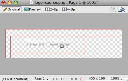
First, open the akiraka-logo-source.png file in Adobe Fireworks. On the right side, you will notice a taskbar named Layers. Inside this column, a list of elements within the source will appear, divided into folders. The first is Web Layers which controls the green slices on the page that are used to export the images. Click the eye which is immediately left to the folder name Web Layers to make it invisible. This allows use to edit the logo.
Step 2
Next, double click on the logo. This will activate the text tool so you can edit the element. Highlight the entire text box with your cursor and type your text instead(such as your company name.)
You will also notice the Japanese style image to the left of logo. Select these and change them if you so desire. In this guide, we shall delete it.
Step 3
Next, reactivate the Web Layers slice. As you did in the initial step, select the eye icon to make it visible and subsequently making the slices visible on the canvas. Select the logo slice, either on the canvas itself or in the Web Layers folder. If you find the slice is too small, hover your cursor the blue points around the slice and drag it to a new size.
Step 4
To export your logo, right click on the green slice that is situated above your new logo. A popup menu should appear with numerous options. The value we want to deal with is "Export Selected Slice...". As the name suggests, this option will export/save this slice only out of the entire source window.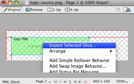
Step 5
If you are new to Fireworks, you may be wondering why it appears that there is only one style variation in the source. This is not the case as we take advantage of the Frame features of Fireworks. You need to simply switch frames to see all the other style variation sources.There are a few ways to change frames and we will show 2 methods that you can use.
In the right column where you find the Layers toolbar including the Web Layers area, you should see another tab/toolbar named Frames. Just left click on the title Frames to enter the frames area. Then you can click on either of the frames which are named to show which style variant is on that particular frame.
The second method is the most easiest and simplistic. At the bottom of the Fireworks canvas is a row of buttons, arrows just as previous and next. Select the arrows to switch between frames.
 [span class=attention]By default, the source should set the export file format to PNG32. If this is not the case, you will need to change your Fireworks export settings. Firstly, expand the Optimise & Align taskbar in the upper right of Fireworks. From the available dropdowns, select PNG32.[/span]
Step 6
Once you have successfully edited then exported your new logo, you will need to upload it to your server. This process is best done via a FTP client such as Filezilla- Open your FTP client on your local computer.
- Login to your web server where Akiraka is installed.
- Navigate to the /templates/rt_akiraka_j15/images/body directory.
- Upload logo.png (and any other logo related images) to this directory (You may need to browse on the local panel in the FTP client to find where you have exported your logo).
- Clear your browser cache before viewing such as using the keyboard commands on Windows, Ctrl+F5.
Publié dans
Demo Pages
A guide to the basic Akiraka customisation options that can be configured in the template manager
The names of the various selections denote the area that they apply to. [span class=alert]Click the Custom Styles button in the toolbar to output your custom style configuration into the Custom Config output box, underneath all the params. You will use these values in the styles.php file to customise your own defaults[/span]
Preset Style
The template is bundled with 10 pre-made style variants that be be easily and quickly chosen from the template configuration. There is also an option for Custom which you will choose if you do not wish to use the preset styles. [span class=attention]NOTE: The Header Color ... Footer Link options will not work unless you click Custom in the Preset Styles section.[/span]Colour Chooser Options
If you selected Custom in the Preset Styles option, you will now have a choice of 27 options to customise your sites colour scheme. The options are divided in 3 areas, the name, such as Header Color; an input field with a HEX colour value, such as #fff; and a colour palette box, which, on click, will show a visual colour chooser. Therefore, you can either manually type your desired colour into the input field or select the colour from the popup. The changes will appear live in the preview above all the selections.The names of the various selections denote the area that they apply to. [span class=alert]Click the Custom Styles button in the toolbar to output your custom style configuration into the Custom Config output box, underneath all the params. You will use these values in the styles.php file to customise your own defaults[/span]
Overlay Textures
Choose from 5 varying overlaying texture options that will load onto the Akiraka template.Fixed Header
Select whether the header always appears, pinned to the top of your website or not.Fixed Footer
Select whether the footer always appears, pinned to the bottom of your website or not.Display Frontpage Component
This setting allows you to select whether the frontpage area (where content items are placed) is active or not. This is useful if you wish to have an entirely modular frontpage and no article-based content.IE6 Warning
Warn your visitors using Internet Explorer 6 to upgrade to a more secure version with this toggle. This option activates a javascript based dropdown in IE6 at the top of the template where a description of why IE6 is a redundant browser is visible. The warning will only appear once as its stored via a cookie.Font Family
You can choose which font you would like to use for your entire website, these are all web standard fonts.Template Width
This template configuration option allows you to easily change the width of the template itself, simply change the number to another pixel value.LeftColumn Width
This template configuration option allows you to easily change the width of the left column, simply change the number to another pixel value.RightColumn Width
This template configuration option allows you to easily change the width of the right column, simply change the number to another pixel value.Left Inset Width
This template configuration option allows you to easily change the width of the left inset position, simply change the number to another pixel value.Right Inset Width
This template configuration option allows you to easily change the width of the right inset position, simply change the number to another pixel value.Splitmenu Location
One of the template's menu options is splitmenu which displays the first level items in the horizontal menu bar and the 2nd in a side column module. This option allows you to choose between the left column or the right column.Default Font
This option allows you to choose what the font size will be, you have 3 options to choose from, these are small, default and large.Show Main Logo
Choose whether the logo area has the template logo image, or is the logo module position. If this option is set to no and there are no modules assigned to the logo area, it will collapse completely.Show Copyright
Choose whether the copyright area has the RocketTheme logo image, or is the footer module position. If this option is set to no and there are no modules assigned to the footer area, it will collapse completely.Show Font Controls
This setting allows you to disable the text size controls in the upper right of the template.Mootools / Javascript Compatibility
Enable or disable js compatibility mode for better compatibility with non mootools based js libraries. Warning, setting to "true" will cause several js template features to not work properlyMenu Type
Akiraka is bundled with 4 menu options, 3 of which are integrated menu approaches. These are splitmenu, moomenu, suckerfish and module. Splitmenu displays the 1st level menu items in the horizontal bar and the 2nd in the side column; moomenu and suckerfish display the menu items in dropdown lists with moomenu having a javascript powered approach; and the module options turns the menu bar into the toolbar module position so you can insert modules into the area (this will disable the menu however). You can also select none so the entire horizontal menu does not appear.Drop Down Rows per Column
The maximum number of menu item rows per a column. Applicable only to MooMenu and Suckerish, as well as second+ menu levels.Drop Down Columns
The number of columns for a dropdown. Applicable only to MooMenu and Suckerish, as well as second+ menu levels.Multi-Column Level
The menu level that is affected by the multiple column dropdown affect. Set to 0 to affect all dropdown levels or set a number greater than 0 to specify a particular level with the multiple column function. Applicable only to MooMenu and Suckerfish.Menu Name
The following parameter controls which Joomla menu is loaded for the horizontal navigation bar, by default this is mainmenu but you can change it to whatever menu such as othermenu.
Publié dans
Demo Pages
[span class=alert]Note: RokNavMenu is an essential module for the template. It is required for the modules to work so ensure that you install it into Joomla.[/span]
[list class=bullet-1][li]Hover support for IE6 using the sfHover javascript class just like in Suckerfish.[/li] [li]Fully degradable to standard SuckerFish menu if javascript is not supported.[/li] [li]Configurable mouse-out delay to allow for accidental mousing out of the menu.[/li] [li]Completely customizable animation effects using MooTools transitions. Can be configured in X and/or Y directions.[/li] [li]Support for fade-in transparency[/li] [li]Experimental support for IE6 z-index bug using the iFrame hack.[/li][/list] An example configuration as used in the demo:
For example, "Bounce.easeIn or Bounce.easeOut or Bounce.easeInOut" produce a bouncing effect.[/li] [li]BG: This is an added effect with Moomenu that allows a background fade (whether solid colour or image) to appear on hover of the first level Moomenu items so you will have a transition for the first level background and reveal of the second level dropdowns. With this setting, you can decide whether this feature is active as well as define the duration / transition of the moveover and mouseout state (i.e. when you hover over the menu, then move your cursor away).[/li] [li]Submenu: Yet another feature in the new RokMoomenu. This appears add a javascript based hover on the submenu items of Moomenu. You can control all the necessary parts f the javascript effect form transition to duration as well as the hover state.[/li][/list] [span class=attention]For more details with diagrams, visit the Mootools documentation site[/span]
Akiraka features an array of elegant, professional and exclusive menu systems. Here you can read an overview of the Akiraka menu configuration options.
[span class=attention] Video Tutorial Currently Available! Launch the Joomla Menu Setup Video Tutorial now![/span]Selecting your Menu Style
Akiraka allows you to choose from 4 menu modes:
[list class=bullet-1][li]RokMooMenu - The advanced menu system based on the ever popular Suckerfish menu style, featuring mootools powered transitions and effects.[/li] [li]Suckerfish - The versatile dropdown menu is an option in combination with RokMooMenu to minimize library conflicts and improve site performance.[/li] [li]SplitMenu - The venerable SplitMenu is a solid choice for navigation. It works by rendering the top-level menu options horizontally, and the submenu/child items are rendered in a module on the side.[/li] [li]No Menu Bar - Setting the menu type to "none" will remove the horizontal menu as well as the menu bar graphics making the header flush with the main content giving you more control over the appearance of your site.[/li][/list]You can designate which menu type you want to use on your site with a single control in the template configuration.
DropColum Menu
A brand new menu function, the Multiple Drop Column ability. This applies only to MooMenu and Suckerfish and allows for multiple drop down columns instead of the typical single variant. The advanced options with this feature, allow you to choose the number of columns, specify individual menu levels which exhibit the behaviour and restrict the number of columns per row. A truly versatile new feature as showcased on this demo.The Powerful & Popular RokMooMenu
This menu has been developed from scratch using the latest and greatest MooTools JavaScript framework. The RokMooMenu is a highly advanced and fully customisable menu system. Some of the great features include:-[list class=bullet-1][li]Hover support for IE6 using the sfHover javascript class just like in Suckerfish.[/li] [li]Fully degradable to standard SuckerFish menu if javascript is not supported.[/li] [li]Configurable mouse-out delay to allow for accidental mousing out of the menu.[/li] [li]Completely customizable animation effects using MooTools transitions. Can be configured in X and/or Y directions.[/li] [li]Support for fade-in transparency[/li] [li]Experimental support for IE6 z-index bug using the iFrame hack.[/li][/list] An example configuration as used in the demo:
Menu Settings
[list class=bullet-1][li]Bgiframe: Can be true or false. Only turn on if you are having problems with IE and z-index. This feature is experimental.[/li] [li]Delay: Defaults to 500ms. This is the how long you can mouse off the menu before it vanishes.[/li] [li]Props: These are the properties that will be applied to the menu. Can be any combination of opacity, width, height. The two properties, width and height are affected by the transition defined in opts.[/li] [li]Duration: The time in ms the animation will run for.[/li] [li]Transitions: Any of the available MooTools transitions. See below for more details.For example, "Bounce.easeIn or Bounce.easeOut or Bounce.easeInOut" produce a bouncing effect.[/li] [li]BG: This is an added effect with Moomenu that allows a background fade (whether solid colour or image) to appear on hover of the first level Moomenu items so you will have a transition for the first level background and reveal of the second level dropdowns. With this setting, you can decide whether this feature is active as well as define the duration / transition of the moveover and mouseout state (i.e. when you hover over the menu, then move your cursor away).[/li] [li]Submenu: Yet another feature in the new RokMoomenu. This appears add a javascript based hover on the submenu items of Moomenu. You can control all the necessary parts f the javascript effect form transition to duration as well as the hover state.[/li][/list] [span class=attention]For more details with diagrams, visit the Mootools documentation site[/span]
Creating the dropdown menu items
To have specific menu items appear as sub items, you must assign them to the specific navigation item in which they will originate from. The following tutorial will show you how simple it is to create your ideal menu system.Step 1 - Navigation
Once you have logged into the Joomla! Administration Area, you must navigate to the Menu area. Hover over the Menu item in the taskbar to show the dropdown menu. For this example, we are going into the mainmenu but the technique is exactly the same for all menus in the Administrative area.Step 2 - The Menu Manager
You will then be transported to the Menu Manager for mainmenu. At this point, you can do two things. The first is to edit an existing menu item, which we will be doing in this tutorial or create a New menu item to be subordinate to an existing item. Click on the item you want to be part of the dropdown menu.Step 3 - Assigning a Parent Item
You can now assign the content item to the mainmenu item in which you want to be in the dropdown menu. Identify the "Parent Item" section of the manager. You will select the item in which you wish to be the parent and the source of the dropdown menu. In this example, we have selected "Home".
Publié dans
Demo Pages
Learn all about the exciting RocketTheme exclusive modules that are included in the Akiraka template release. Here you can find instructions for installation and configuration for each of the custom modules/scripts.
[span class=attention] Video Tutorial Currently Available! Launch the Joomla Template Module Installation Video Tutorial now! (Requires Flash)[/span]Step One: Installing the Module
[list class=bullet-1][li]Download the akiraka-extensions-j15.zip archive from the Akiraka download section of the RocketTheme Joomla! Club. Unzip the archive and inside you will find individual zip files for each of the extensions[/li] [li]Login in to your administrator console on your Joomla! website and navigate to the Extensions menu item, and select Install/Uninstall from the dropdown menu. [/li] [li]In the Upload Package File section, click the Choose File button and select one of the mod_modulename.zip that was inside of the zip file you downloaded earlier. Next click the Upload File & Install button to install the module[/li][/list]Step Two: Publishing the Module
[list class=bullet-1][li]Now the module is installed it must be published in the appropriate module position and configured to suit our needs. From the top menu, select Extensions > Module Manager[/li] [li]This will take you to the Site Module Manager which allows you to configure the placement and configuration of all modules in your Joomla website[/li] [li]Locate the module from the list. Remember there could be a few pages. Once you have found it, you can publish in 2 ways: The first is selecting the cross next to the tile or clicking the title then set Publish to Yes followed by Save[/li][/list] [clear]RokAjaxSearch Module
RokAjaxSearch is a mootools enhanced search module. Simply type a search value into the box, and search results will dynamically appear in a popup allowing you quick access without having to load the search page.We will take a quick look at the parameters you will find when you install this module. There are 4 columns, parameters, options, demo and description. The parameter column lists each available setting for the module; options lists the available options to choose from; demo lists the options chosen on the demo and description outlines what the module does.
Parameter
Show Title
Enabled
Position
Module Class Suffix
Search page URL
Inlcude RokAjaxSaerch CSS
Saerchphrase
Order
Limit
Hide div id(s)
Link to all results
Show Description
Include Category/Section
Show Read More
Demo
No
Yes
search
leave blank
index.php?option=com_search&view=search
Yes
Any Word
Newest First
10
leave blank
Yes
Yes
Yes
Yes
Description
Enable/Disable the module header
Enable/Disable the module
Choose the module position
Add an extra tag to the HTML
Link to the search page
Set No to load template specific CSS
Search parameters
Order of results
Number of results
Specify div IDs to be exempt from search
Link all search results
Show description with results
Include category/section in results
Show read more
RokNavMenu Module
RokNavMenu is now an essential ingredient of the RocketTheme templates. It provides various functions which are above and beyond what the mainmenu, and the subsequent template overrides. Therefore, much more sophisticated menus can be constructed providing you with a much greater degree of usability. It is an essential install for the integrated menu systems to operate.We will take a quick look at the parameters you will find when you install this module. There are 4 columns, parameters, options, demo and description. The parameter column lists each available setting for the module; options lists the available options to choose from; demo lists the options chosen on the demo and description outlines what the module does.
Parameter
Show Title
Enabled
Position
Menu Name
Limit Levels
Start Level
End Level
Always show submenus
Menu Tag ID
Menu Class Suffix
Module Class Suffix
Max Menu Depth
Show Menu Icons
Menu Icon Link
Demo
Yes
Yes
toolbar
mainmenu
No
0
0
No
leave blank
leave blank
leave blank
10
No
No
Description
Enable/Disable the module header
Enable/Disable the module
Position of the module
Menu that is loaded
Limit number of sub-levels
Starting menu level
Ending menu level
Always show submenu items
ID added to the menu code
Class suffix to the menu
Class suffix to the module
Max number of menu levels
Show menu icons
Link menu icons
RokTabs Module
RokTabs, the fully independent and incredible flexible standalone version of the former RokSlide. The module itself is installable into Joomla and can be easier utilised on any template, not just Akiraka. As it name implies, its a tabbed based module to efficiently showcase your content to your visitors.We will take a quick look at the parameters you will find when you install this module. There are 4 columns, parameters, options, demo and description. The parameter column lists each available setting for the module; options lists the available options to choose from; demo lists the options chosen on the demo and description outlines what the module does.
Parameter
Show Title
Enabled
Position
Category
Section
Order
Authors
Theme Style
Width
Max # of Tabs
Transition Duration
Transition Type
Transition Effect
Tabs Position
Tabs Title
Incremental text
Hide h6 tags
Autoplay
Autoplay Delay
Module Suffix
Demo
Yes
Yes
Right
FP Tabs
RT Demo Content
Recently Modified First
Anyone
base
230
8
600
Scrolling
Quad.easInOut
Top
By Content Title
Tab
Yes
No
2000
promo
Description
Enable/Disable the module header
Enable/Disable the module
Position of the module
Category of content
Section of content
Ordering of content
A filter for the authors
Select a theme/style
Width of the module
Max number of Tabs
Time for transition
Type of transition
The transition effect
Position of the tabs
Determine the tab title
Set an incremental text
Hide h6 titles
Rotate automatically
Set delay on auto-rotation
A module class suffix
Publié dans
Demo Pages


![[rbxshot img="images/stories/rokcandy-ini-thumb.jpg"]RokCandy default.ini file[/rbxshot]](/images/stories/rokcandy-ini.jpg)
![[rbxshot img="images/stories/rokcandy-example-thumb.jpg"]RokCandy in action![/rbxshot]](/images/stories/rokcandy-example.jpg)
![[rbxshot img="images/stories/rokcandy-admin-thumb.jpg"]RokCandy Administrator[/rbxshot]](/images/stories/rokcandy-admin.jpg)